Toxin Graphics – Introduction
It has taken me a long time and a lot of experimentation to get the graphics right for Toxin. When I began, I didn’t really have a single picture in mind of how the game was going to look. I knew I wanted abstract, and I knew I wanted a contemporary style influenced by information graphics and designers like James White, but that was all. Most of my inner images of the game were fleeting. I had a gameplay concept and a “feel” in mind more than anything else.
Also, Toxin is the first game I have worked on since the Smartphone stuff I did around 2002-2003. I was desperate to get back into game development and I mistakenly thought I could begin again where I left off. It was like running into a brick wall. The first artwork I did was so bad I deleted everything, took the bus into Stratford on Avon and spent the rest of the day sitting by the side of the river in despair!
It took me some time to reach my old level again and then improve on it. As much as I have enjoyed developing Toxin and the creative discoveries I have made, there has been a great deal of struggle and fruitless experimentation involved.
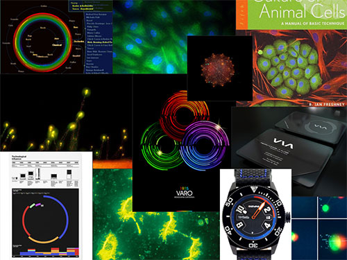
The interior designer and UK TV legend Laurence Llewelyn-Bowen was an unlikely influence. On his TV home makeover shows he’d get his clients to collect images they liked and pin them to a board for inspiration. I had a Toxin folder on my laptop which I filled with images from ffffound and other design inspiration sites. When I got stuck I’d fire up IrfanView and spend half an hour blanky staring at images until some ideas popped up. I highly recommend this practice. A few of the images from my Toxin folder are in the image below.

That watch is a Dievas Aqualuna Blue Professional. No I can’t afford one yet. Buy Toxin!
 The first thing I did was the main ship, which is the only thing I got right first time; it remained unchanged throughout development whereas everything else got remade at least three times! I think it works really well and has a nicely balanced, iconic look. I designed it in a vector drawing package which I later abandoned in favour of using rendered, animated splines created in a 3d program.
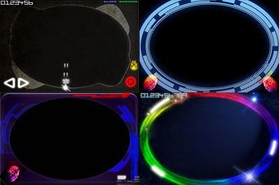
The background was next. It was essential to get the background style nailed as it would define the look of the whole game. I tried a few different styles as you can see in the rough drafts below.

One of my biggest goals here was to create something that looked good within the phone. Too often, mobile games just present windows on to the game world without any consideration for the device that is running the game. To me this is like designing a watch face without taking the case into account.
Next time I’ll talk about how Toxin uses procedural graphics and describe how I used Photoshop scripting and Processing, a Java based generative arts platform to create much of the game’s artwork.

0 Comments